ROC SKINCARE
Brief
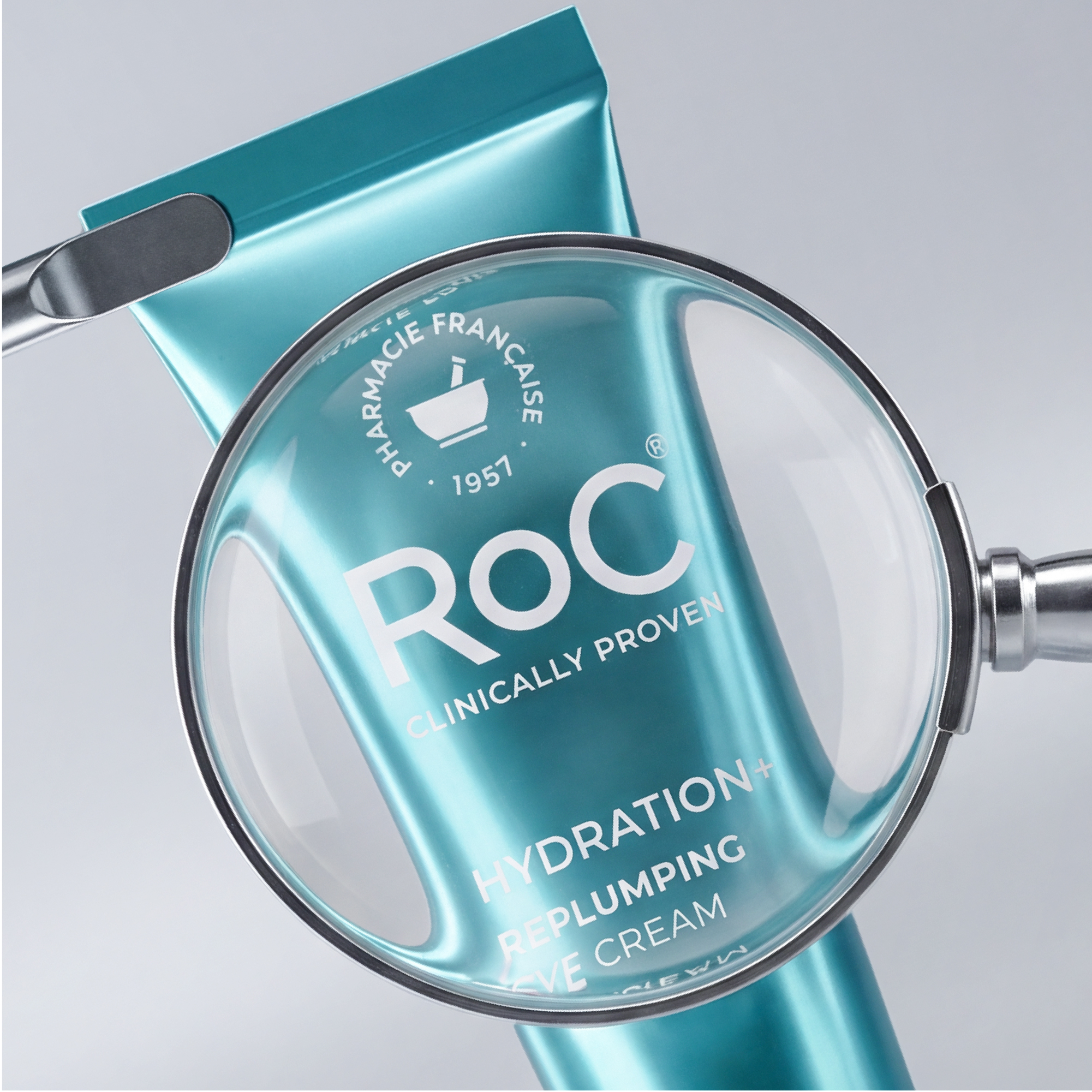
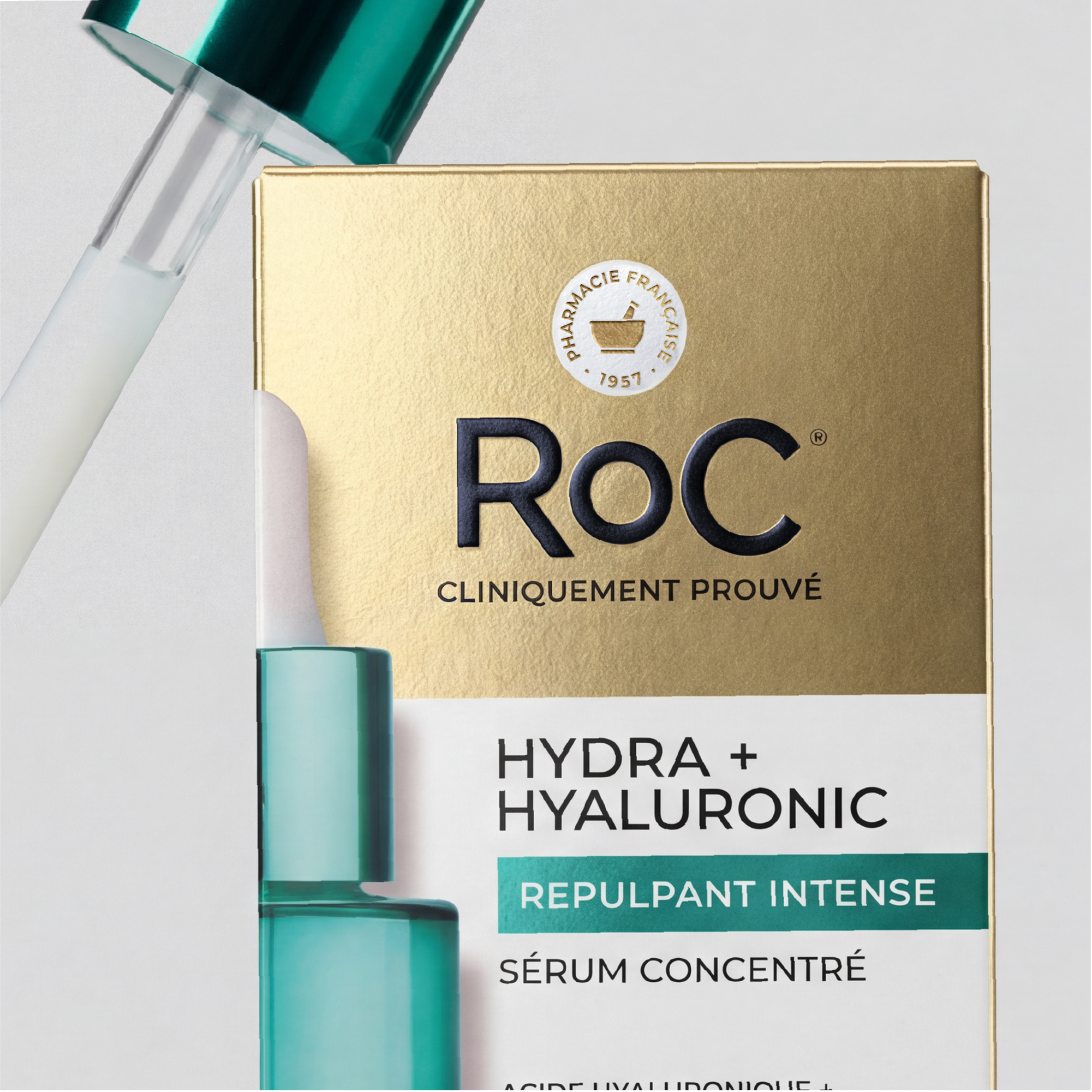
How to support RoC, a pioneering French retinol brand and leader in the United States, in its return to the European market? The challenge was twofold: modernize its image to appeal to a new generation of consumers, while staying true to its positioning as a clinically proven brand.
Idea
An international collaboration to mark the beginning of a new era for RoC, built around three pillars:
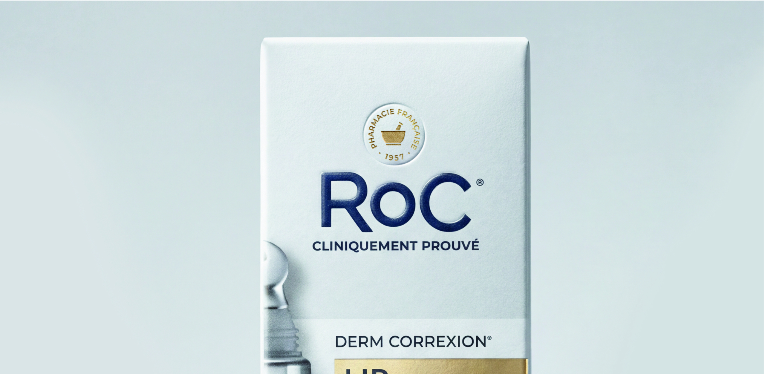
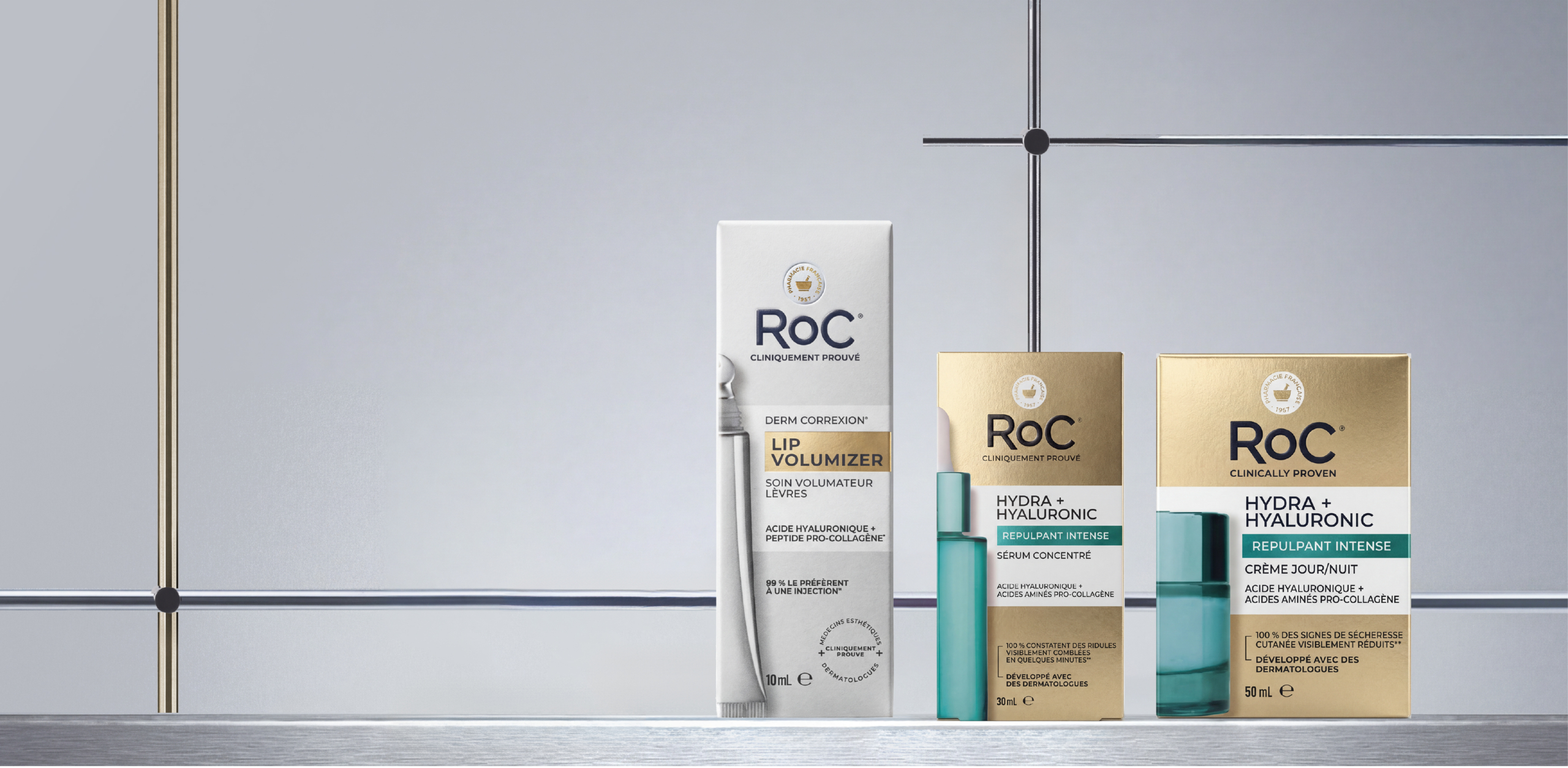
- A redesigned brand architecture to assert its positioning
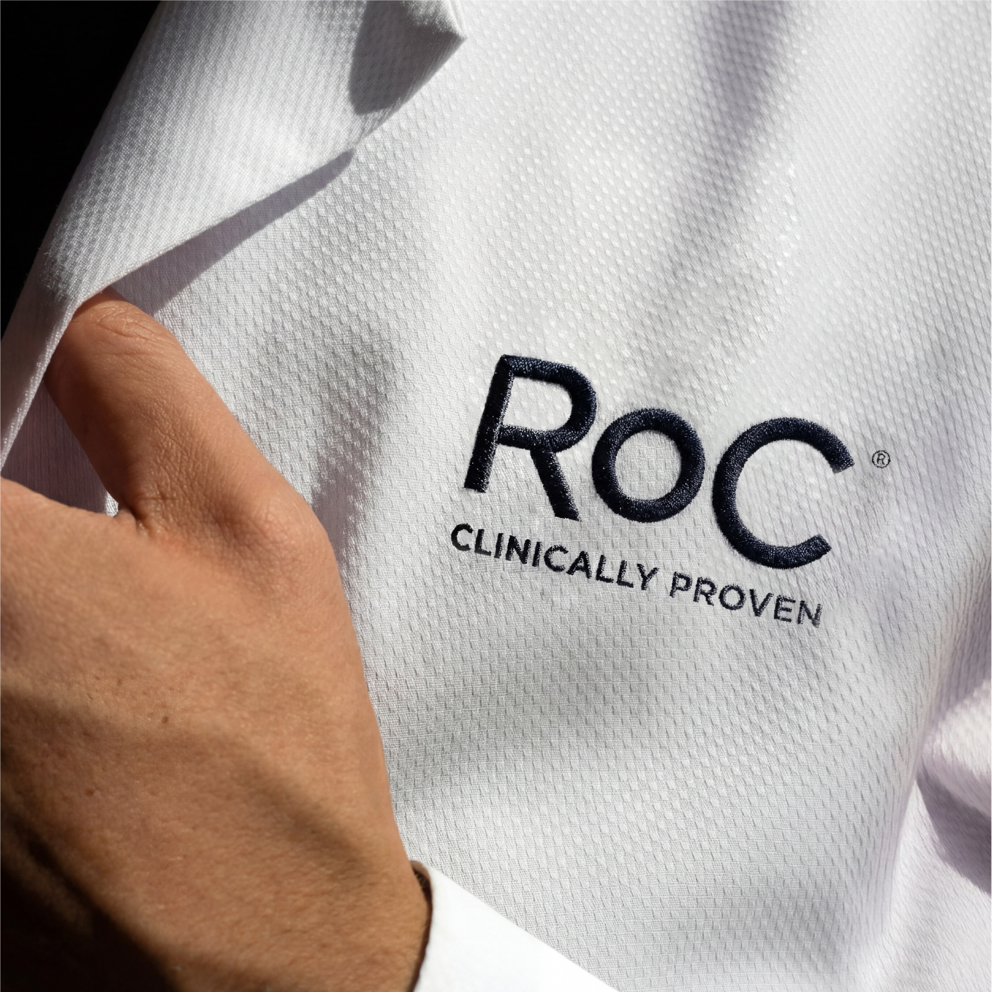
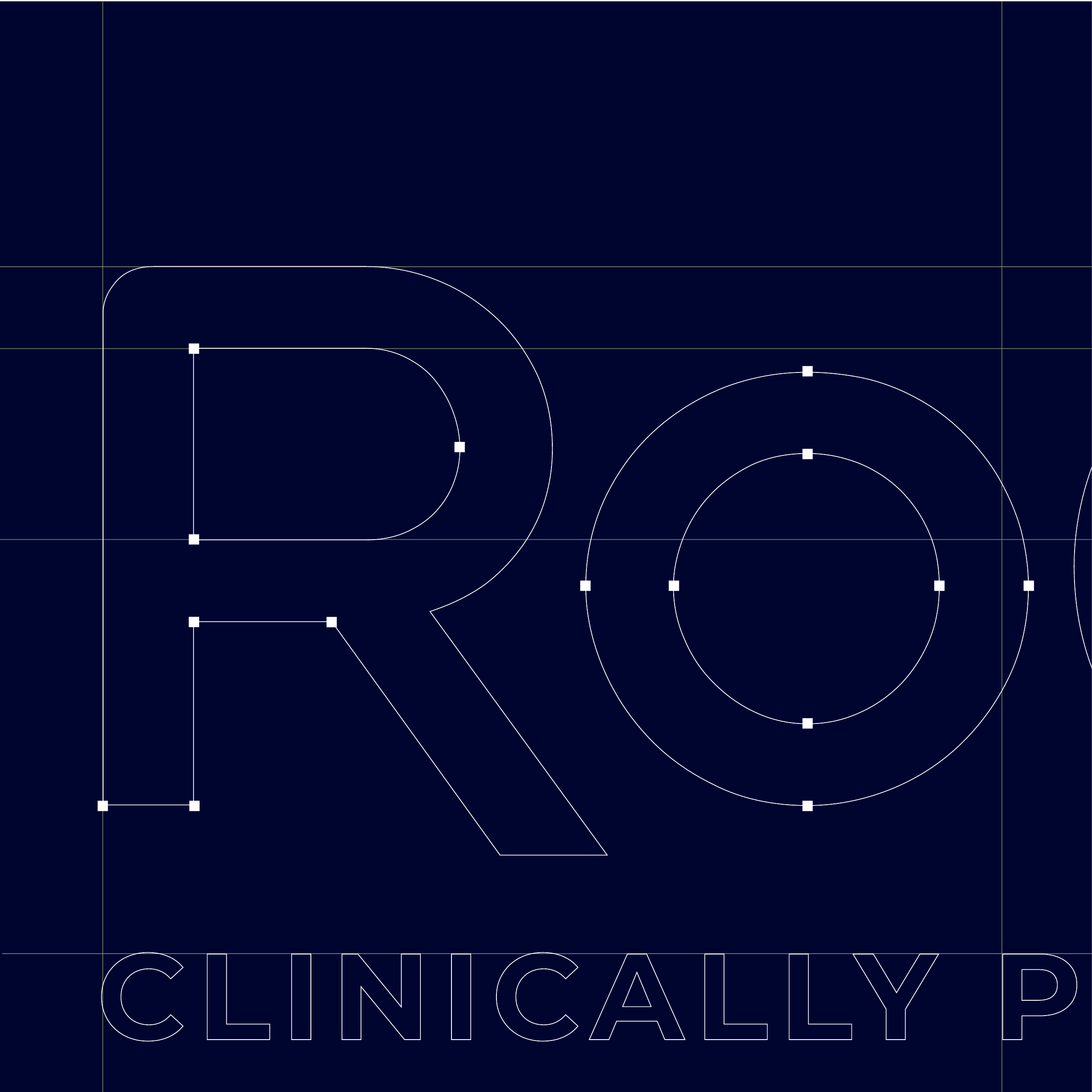
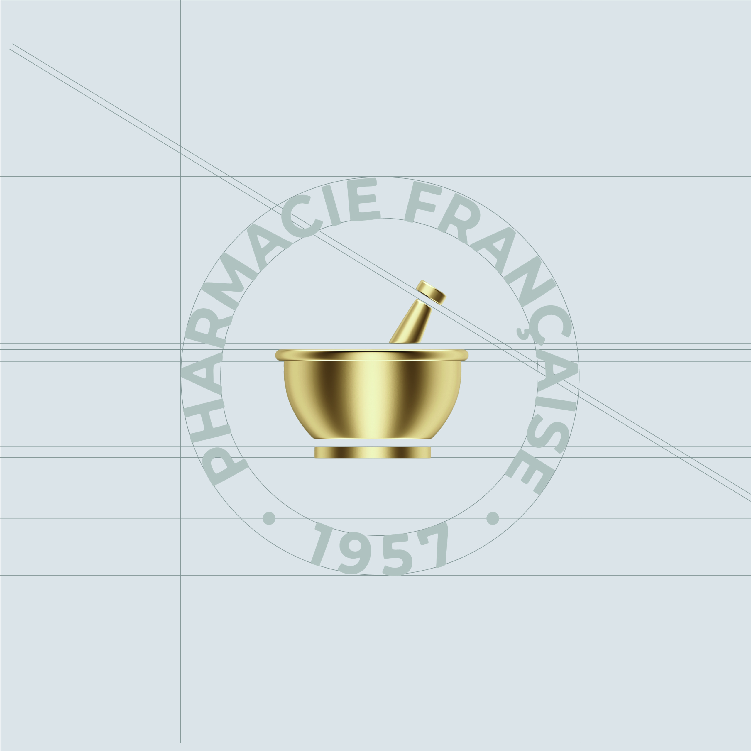
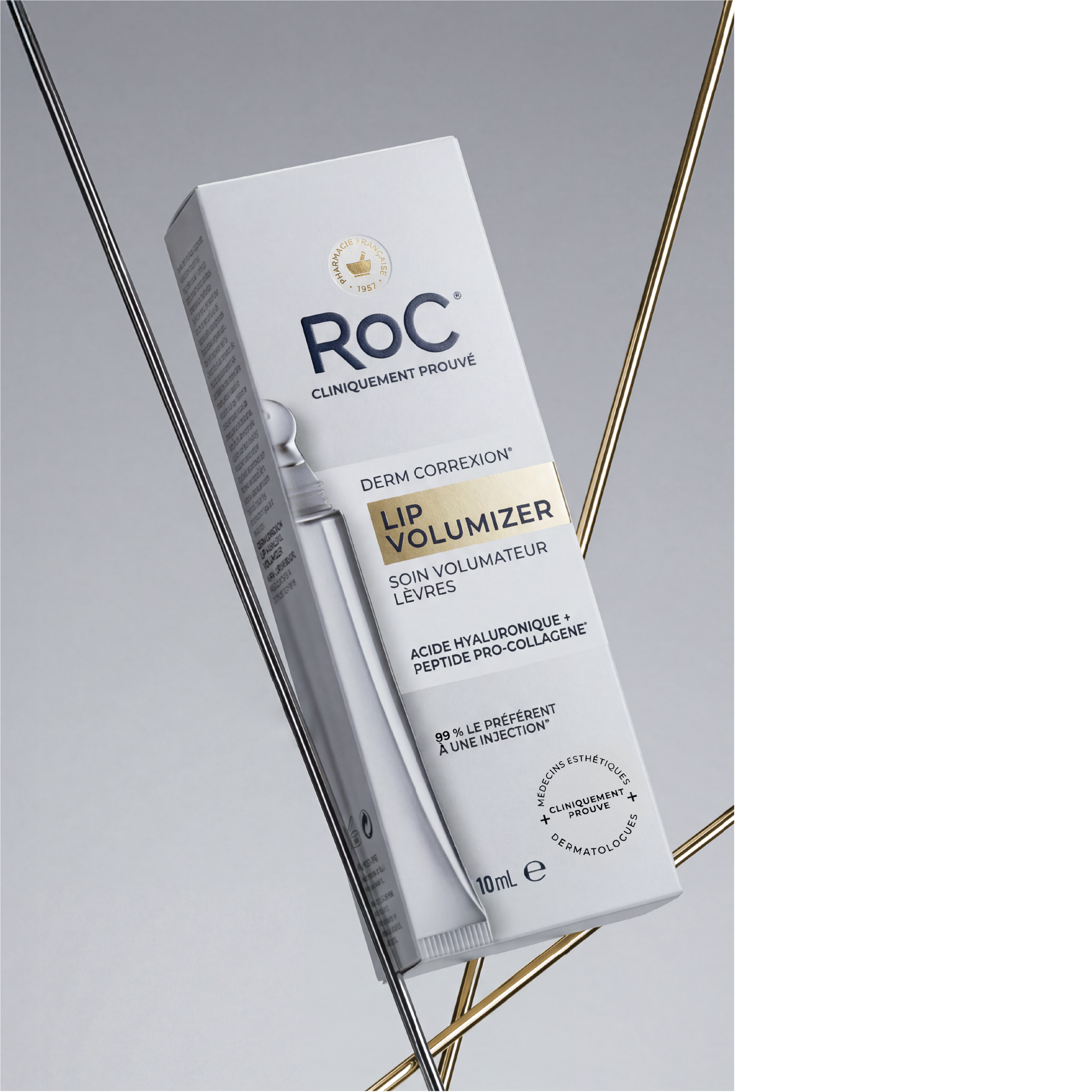
- The "Stamp" and typography; a reworked logo and typeface to balance medical precision with modernity.
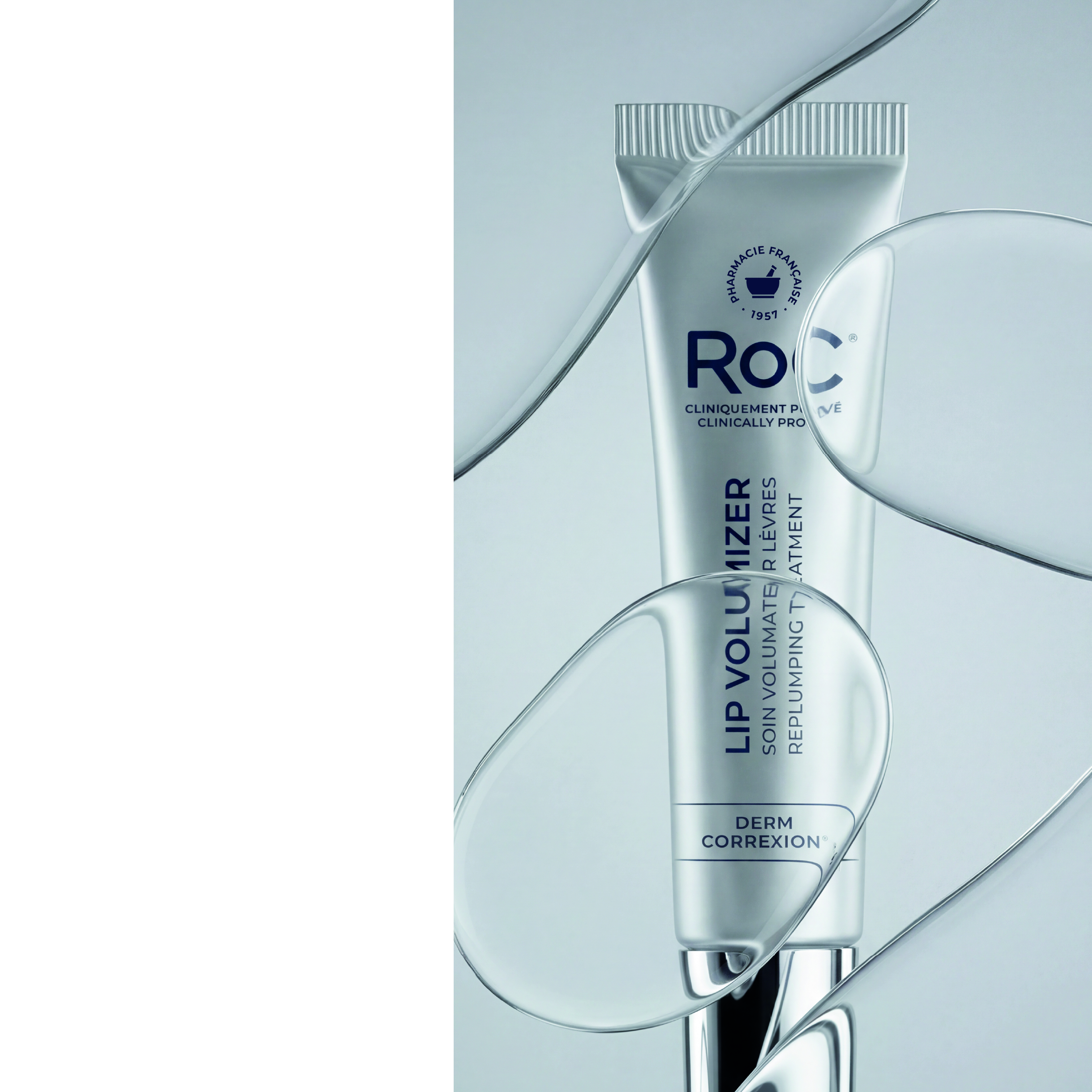
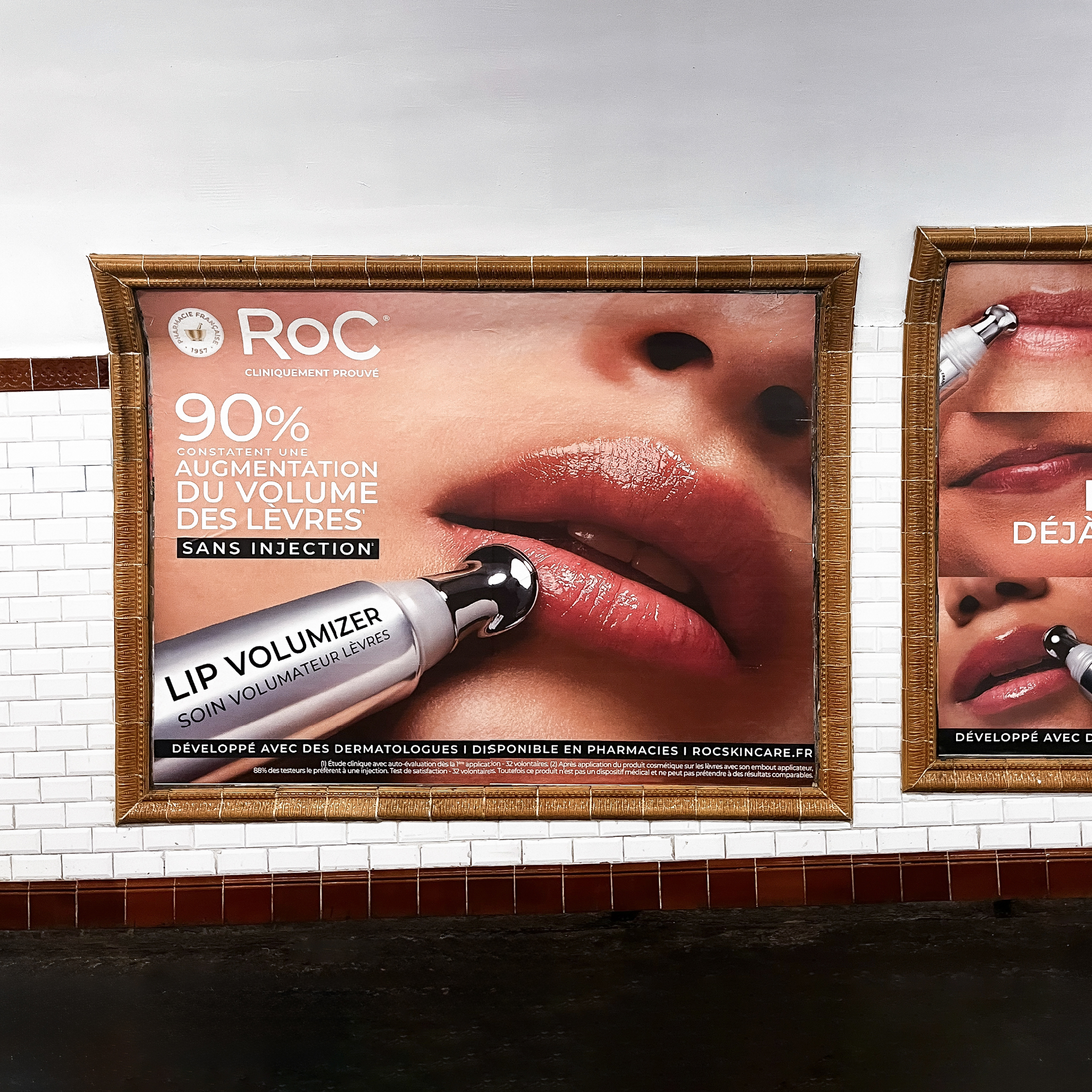
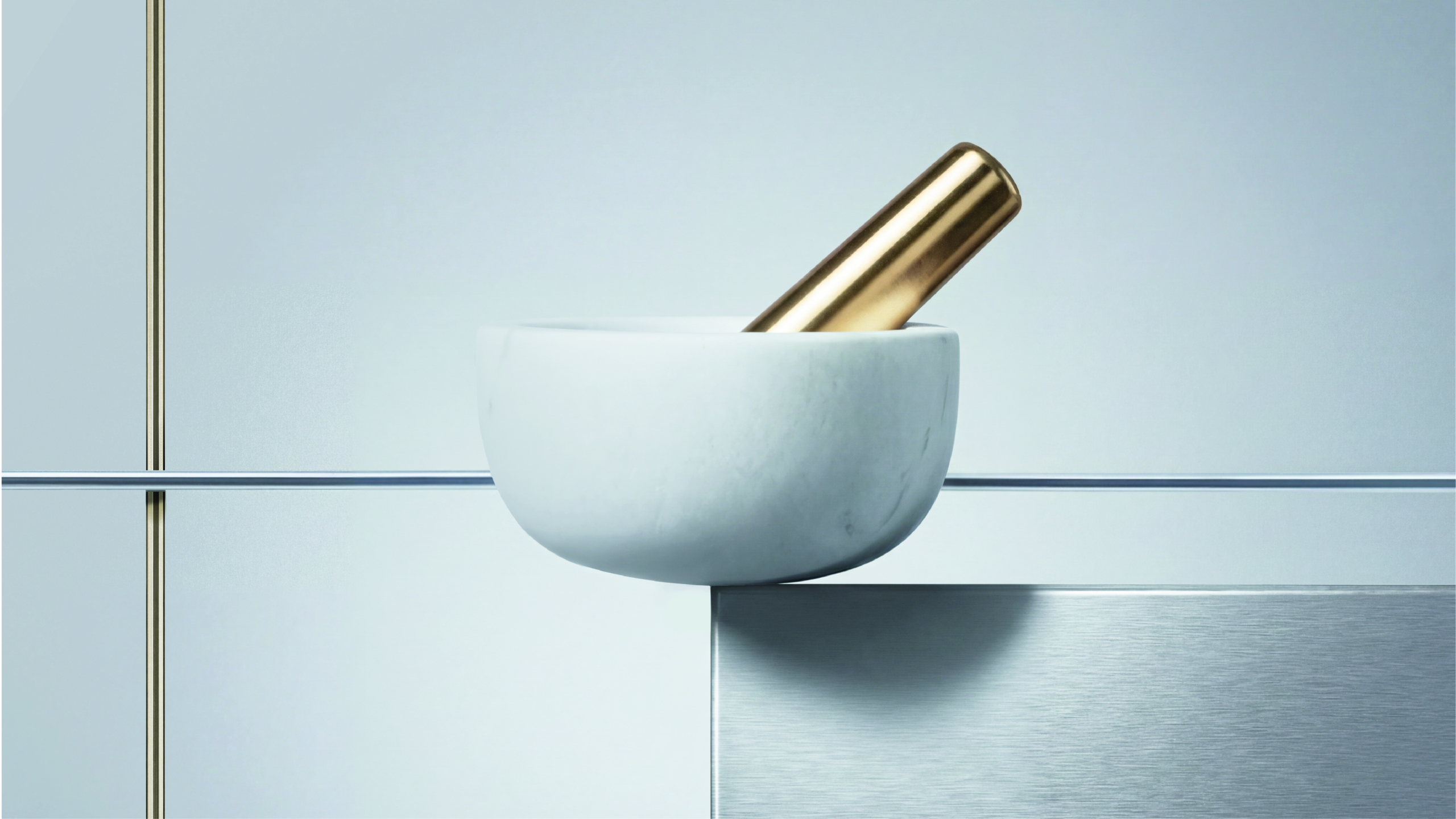
- A refined visual identity, focused on efficacy and visible results, with retinol as the hero ingredient.
The result ?
A cohesive, modern, and effective identity that positions RoC as a skincare brand that delivers on its promise.
- Visual Identity